728x90
Mouse Hover Effect

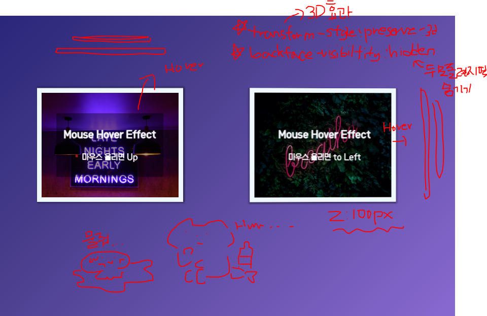
마우스를 올려놓거나 내렸을 때 3D 효과가 나오는 애니메이션을 공부했습니다.
01. HTML
위, 아래와 오른쪽,왼쪽인 두가지 버전을 하였습니다.
🐇 HTML 코드
<div class="hover__wrap">
    <div class="hover__updown">
      <figure class= "front">
        <img src="https://github.com/Packsunhye/coding/blob/main/codepen/codepen01.jpg?raw=true" alt="">
        <figcaption>
          <h3>Mouse Hover Effect</h3>
          <p>마우스 올리면 Up</p>
        </figcaption>
      </figure>
      <figure class= "back">
        <img src="https://github.com/Packsunhye/coding/blob/main/codepen/codepen03.jpg?raw=true" alt="">
        <figcaption>
          <h3>Mouse Hover Effect</h3>
          <p>마우스 내리면 Down</p>
        </figcaption>
      </figure>
    </div>
    <div class="hover__leftright">
      <figure class= "front">
        <img src="https://github.com/Packsunhye/coding/blob/main/codepen/codepen02.jpg?raw=true" alt="">
        <figcaption>
          <h3>Mouse Hover Effect</h3>
          <p>마우스 올리면 to Left</p>
        </figcaption>
      </figure>
      <figure class= "back">
        <img src="https://github.com/Packsunhye/coding/blob/main/codepen/codepen04.jpg?raw=true" alt="">
        <figcaption>
          <h3>Mouse Hover Effect</h3>
          <p>마우스 내리면 to Right</p>
        </figcaption>
      </figure>
    </div>
</div>
02. Css
중요한 코드는 transform-style : preserve-3d; = 3D 효과를 주는 css backface-visibility: hidden; = 뒤로 돌리면 사라지게 하는 css 입니다.
🐇 css 코드
body {
    font-family: 'LocusSangsang';
    background-image: linear-gradient(135deg, #191970 0%, #483d8b 40%, #9370db 100%);
    height: 100vh;
    overflow: hidden;
  }

  .hover__wrap{
    display: flex;
    justify-content: center;
    align-items: center;
    height: 100vh;
  }

  .hover__wrap > div {
    max-width : 400px;
    margin: 3%;
    position: relative;
    perspective : 1000px;
  }

  .hover__wrap > div img {
    width: 100%;
    border : 10px solid #f0f8ff;
    box-shadow : 2px 2px 2px 2px rgba(0,0,0,0.2);
    vertical-align: top;
    box-sizing: border-box;

  }

  .hover__wrap > div .front {
    transition : transform 1s;
    backface-visibility: hidden;
    transform-style : preserve-3d;
  }
  .hover__wrap > div .back {
    position: absolute;
    left: 0;
    top: 0;
    z-index: -1;
    transition : transform 1s;
    transform-style : preserve-3d;
  }
  .hover__wrap > div figcaption {
    background: rgba(0,0,0,0.4);
    color: #f8f8ff;
    padding: 10px;
    text-align: center;
    line-height: 1.5;
    position: absolute;
    left: 50%;
    top: 50%;
    transform :  translate(-50%, -50%) translatez(100px);
    width: 60%;
    backface-visibility: hidden;
  }

  /*  mouse hover effect */
  .hover__updown .front {
    transform : rotateX(0deg);
  }
  .hover__updown:hover .front {
    transform : rotateX(180deg);
  }

  .hover__updown .back {
    transform : rotateX(-180deg);
  }
  .hover__updown:hover .back {
    transform : rotateX(0deg);
  }

  .hover__leftright .front {
    transform : rotateY(0deg);
  }
  .hover__leftright:hover .front {
    transform : rotateY(180deg);
  }

  .hover__leftright .back {
    transform : rotateY(-180deg);
  }
  .hover__leftright:hover .back {
    transform : rotateY(0deg);
  }
03. 이미지로 한눈에 알아봅시다.
728x90
'CSS' 카테고리의 다른 글
| Text animation (2) | 2022.09.22 |
|---|---|
| box Animation (2) | 2022.09.22 |
| Wave Animation (5) | 2022.09.19 |
| 애니메이션 만들기 (3) | 2022.09.08 |
| css intro (2) | 2022.09.08 |


댓글